High Quality & Great Pricing l # Plates from $29 l Dirt Bike Kits $175 l Stickers 12 @ $9
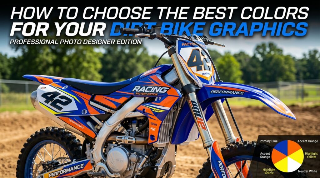
Choosing the right color combination can completely change how your motocross bike looks. Good color choices can make a bike feel cleaner, faster, more professional, and more personal, while poor combinations can make even high-quality graphics feel visually confusing.
This guide on How to Choose the Best Colors for Your Dirt Bike Graphics explains how to select colors that work with your motorcycle, riding style, race number, and overall identity. Whether you ride a KTM, Yamaha, Honda CRF, Kawasaki KX, or Suzuki RMZ, a thoughtful color strategy can make your dirt bike graphics stand out for the right reasons.
The first step in understanding How to Choose the Best Colors for Your Dirt Bike Graphics is looking at the motorcycle itself.
Your plastics, frame, seat, wheels, and factory accents already create a visual foundation. Custom graphics should either complement those colors or intentionally contrast with them.
For example, KTM riders may want to build around strong orange elements, while Yamaha owners may use blue as a base. Honda CRF, Kawasaki KX, and Suzuki RMZ bikes also have recognizable brand colors that can influence a custom design.
You do not have to follow factory colors exactly, but they are useful starting points.
There are two main approaches to color selection.
A matching palette uses similar tones to create a smooth, unified appearance. A contrasting palette uses noticeably different colors to make numbers, logos, and design elements stand out.
This is one of the most important ideas in How to Choose the Best Colors for Your Dirt Bike Graphics.
Matching colors often produce a refined look, while contrasting colors can create more energy and visibility. Riders involved in motocross racing may prefer stronger contrast because race numbers and key details need to remain easy to recognize.
More color does not always mean better design.
One of the easiest ways to create professional-looking dirt bike graphics is to work with a limited palette. Two or three main colors plus a neutral accent can often produce a cleaner result than five or six equally dominant shades.
Black, white, gray, and silver can help balance brighter tones.
This approach makes How to Choose the Best Colors for Your Dirt Bike Graphics much easier because every new element has a clear place within the overall visual system.
Select one color to lead the design.
That dominant shade should cover the largest visual areas or strongly influence the overall look. Then use secondary and accent colors to support it.
This hierarchy helps keep vinyl decal kits organized instead of making every section compete for attention.
Color selection is not only about appearance.
For motocross racing, visibility can matter as well. A race number should be easy to read against the number plate background, even from a distance.
If both the number and background use similar brightness levels, the design may look stylish up close but become difficult to read at speed.
That is why How to Choose the Best Colors for Your Dirt Bike Graphics should include practical contrast considerations.
Dark numbers on light backgrounds or light numbers on dark backgrounds usually provide stronger visual separation.
Your graphics are an opportunity to express your riding style.
Riders who prefer an aggressive look may choose black, red, orange, deep blue, or high-contrast combinations. Those who want a cleaner appearance might favor white, gray, muted tones, and carefully controlled accents.
Bright colors such as neon yellow, electric green, pink, or vivid orange can create a more energetic race-inspired appearance.
The best lesson in How to Choose the Best Colors for Your Dirt Bike Graphics is that there is no single perfect palette for every rider.
The right colors are the ones that fit your motorcycle and the identity you want to create.
Your bike does not exist in isolation.
Helmet colors, jersey designs, boots, gloves, and riding pants can influence how the full motocross setup looks in photos and at the track.
If your riding gear already uses a strong color theme, repeating one or two of those colors in your dirt bike graphics can create a coordinated appearance.
This is especially useful for racers, teams, sponsored riders, and content creators who want consistent branding.
When thinking about How to Choose the Best Colors for Your Dirt Bike Graphics, consider the rider and the motorcycle as one complete visual package.
Popular manufacturers already have strong visual identities.
Orange is one of the most recognizable KTM colors. It works well with black, white, gray, blue, and even selected neon accents.
Blue can be paired with white, black, silver, yellow, or brighter contrasting details for a clean racing look.
Red is naturally associated with many Honda CRF models. Combining it with white, black, gray, or subtle metallic-inspired tones can create a strong visual balance.
Kawasaki KX bikes are closely associated with green. Black and white can help keep the design controlled, while purple, blue, or darker accents can create a more customized appearance.
Yellow is a strong starting point for Suzuki RMZ graphics. Black, blue, white, and gray can provide useful contrast.
These examples make How to Choose the Best Colors for Your Dirt Bike Graphics easier by giving riders an established foundation to build upon.
Color is only one part of the design.
Vinyl decal kits can also create different visual effects depending on the finish and printing style. Glossy elements often feel bright and polished, while matte-inspired graphics may look more understated and aggressive.
Metallic, chrome-style, holographic, or textured effects can also change how colors react to light.
Before finalizing a palette, think about where the bike will be seen most often. A design that looks subtle indoors may appear much brighter in direct sunlight.
A custom graphics kit may include much more than background artwork.
Race numbers, rider names, sponsor logos, team branding, and social handles all need enough contrast to remain visible.
This is where How to Choose the Best Colors for Your Dirt Bike Graphics becomes a design-planning exercise rather than simply choosing favorite colors.
If the main graphics are already visually intense, keep logos and numbers simpler. If the background is minimal, you may have more freedom to use bold colors for important details.
One of the best tips is to evaluate the complete design before committing to it.
Look at how the colors work across the shrouds, number plates, fenders, and other areas instead of judging one small section.
A color that looks great on a number plate may feel too dominant when repeated across the entire motorcycle.
You can explore customization ideas through How to Choose the Best Colors for Your Dirt Bike Graphics and start planning a combination that fits your bike.
Trends can be useful for inspiration, but your graphics may stay on the motorcycle for a long time.
When deciding How to Choose the Best Colors for Your Dirt Bike Graphics, consider whether you will still enjoy the design after the current trend changes.
A strong base palette with a few fashionable accents is often safer than building the entire graphics kit around one short-lived style.
This is especially important for riders investing in premium vinyl decal kits for race bikes, rebuilds, or long-term projects.
Learning How to Choose the Best Colors for Your Dirt Bike Graphics comes down to balance, contrast, personality, and consistency.
Start with the existing colors of your KTM, Yamaha, Honda CRF, Kawasaki KX, or Suzuki RMZ. Choose one dominant shade, limit unnecessary colors, keep race numbers readable, and consider how the motorcycle will look alongside your riding gear.
The best dirt bike graphics are not simply the brightest. They create a clear identity and make every element of the motorcycle feel connected.
Whether you are preparing for motocross racing, refreshing an older bike, or creating a completely personalized setup, thoughtful color choices can make a major visual difference.
Ready to create a color combination that matches your bike and riding style? Contact Boondocks Decals to discuss your custom graphics ideas and start building a more distinctive motocross look.