
High Quality & Great Pricing l # Plates from $29 l Dirt Bike Kits $175 l Stickers 12 @ $9
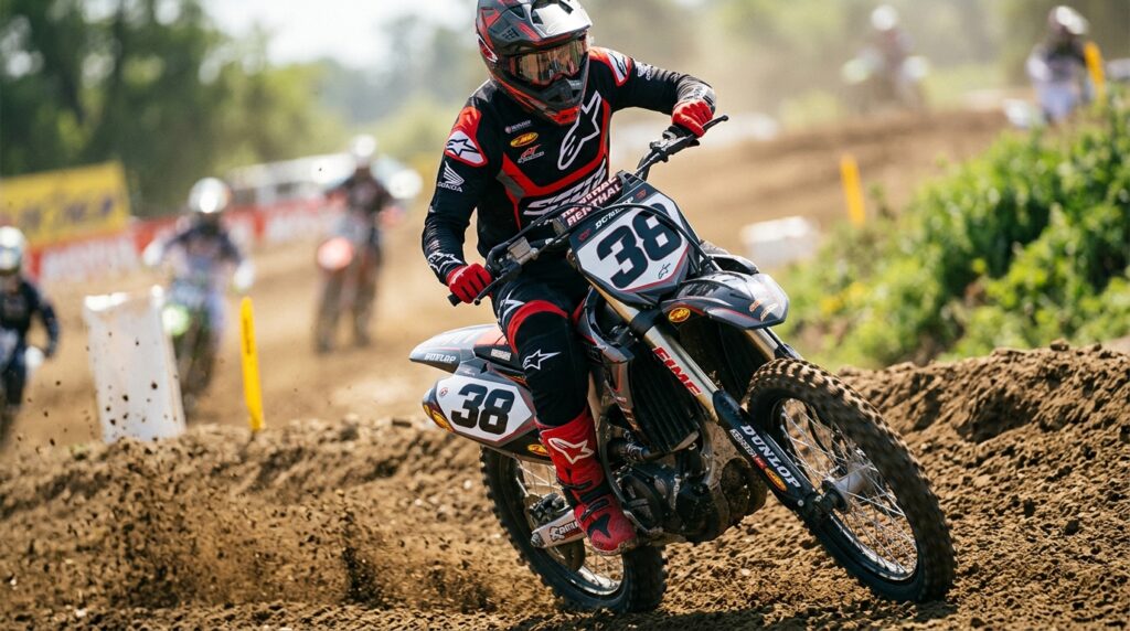
A great number plate can completely change the appearance of a dirt bike. The right font makes race numbers easier to recognize, creates a professional motocross appearance, and helps your graphics look closer to a factory-inspired build. From bold block lettering to sharp modern racing styles, typography plays an important role in a complete graphics design.
If you’re creating a custom race-inspired bike, explore Boondocks Decals for custom dirt bike graphics and vinyl decal kits. This guide to the Best MX Number Plate Fonts for a Factory-Style Look explains how to choose a font, improve readability, and create a professional finish.
When choosing the Best MX Number Plate Fonts for a Factory-Style Look, appearance isn’t the only consideration. Your race number needs to remain readable while you’re riding at speed.
A strong motocross font usually has bold shapes, clear spacing, and enough visual weight to stand out against the number plate background. Complicated fonts may look interesting on a computer screen but become difficult to recognize from the side of a track.
The ideal font combines personality with practical readability.
The Best MX Number Plate Fonts for a Factory-Style Look usually share several characteristics.
Motocross numbers need to be visible from a distance. Thick strokes and strong outlines help create better contrast.
Angular or slightly slanted numbers can create a faster, more dynamic appearance. These styles work particularly well with modern dirt bike graphics.
A consistent visual width helps the complete number combination look balanced. If one number is significantly wider than another, the plate can look uneven.
Even an excellent font can disappear if the number and background are too similar. High contrast should always be considered when designing race plates.
There isn’t one universal choice when it comes to the Best MX Number Plate Fonts for a Factory-Style Look. Different riding styles and graphics designs call for different typography.
Bold Block Fonts: These are classic choices for motocross because they are highly readable and immediately recognizable.
Condensed Racing Fonts: Narrower numbers work well when space is limited on a number plate.
Italic Racing Fonts: A slight forward angle can create a sense of movement and speed.
Angular Fonts: Sharp corners and geometric shapes can complement aggressive modern graphics.
Outlined Numbers: Adding an outline can dramatically improve visibility against busy backgrounds.
The best number plate font should work with the entire motorcycle design.
For example, a clean modern graphics kit may look better with a simple block font, while an aggressive race design may benefit from angular or italic numbers.
Your number should complement the colors, logos, rider name, and other design elements rather than competing with them.
Start Your Graphics with Boondocks Decals to explore custom graphics options and create a design that brings all these elements together.
Different motorcycle brands often inspire different visual styles. Riders building a KTM, Yamaha, Honda CRF, Kawasaki KX, or Suzuki RMZ can use custom typography to create a unique race identity.
A KTM-inspired build might pair well with sharp, modern numbers, while a classic Yamaha or Honda CRF design could benefit from strong block lettering. Kawasaki KX and Suzuki RMZ builds can also use contrasting number styles to create a distinctive appearance.
The important thing is to choose a font based on your complete design rather than simply selecting the most aggressive-looking typeface.
Choosing the Best MX Number Plate Fonts for a Factory-Style Look also means considering the available space.
A font that looks great on a large desktop design may not work once it is placed on a smaller front or side number plate.
Before finalizing your design, consider:
A two-digit number generally gives you more design flexibility than a three-digit number because additional digits require more horizontal space.
Typography isn’t only about choosing a font. Spacing can make a major difference in the finished design.
Numbers that are too close together can visually merge, while excessive spacing can make the plate look disconnected. Professional graphics designers carefully adjust spacing so the complete number looks balanced.
When creating vinyl decal kits, the number layout should be checked against the actual plate dimensions before production.
One of the easiest ways to make race numbers stand out is by adding an outline.
A contrasting outline can separate the number from a busy background and improve visibility during motocross racing. Some designs also use a subtle shadow or secondary border to create additional depth.
However, too many layers can make the number appear crowded. The best factory-style designs usually maintain a clean visual hierarchy.
A factory-style look is about creating a professional racing aesthetic rather than copying another rider’s exact graphics.
You can take inspiration from professional motocross racing while developing your own color combination, number font, sponsor placement, and graphic layout.
This approach creates a bike that feels race-ready while remaining unique to you.
Visibility becomes especially important during motocross racing. Dirt, dust, changing light, and fast-moving bikes can make small or complicated numbers difficult to recognize.
This is why the Best MX Number Plate Fonts for a Factory-Style Look should prioritize clarity.
Think about how your number looks from several feet away, not just how it appears on your phone or computer.
A useful test is to zoom out from your design. If you can still identify the number immediately, your typography is probably working well.
Even the Best MX Number Plate Fonts for a Factory-Style Look won’t produce a professional result if the material or installation is poor.
High-quality dirt bike graphics and vinyl decal kits can provide a cleaner printed appearance and help the design withstand demanding riding conditions.
Quality vinyl is particularly important for riders who regularly deal with mud, dust, sunlight, washing, and repeated contact with riding gear.
Proper installation is equally important. Clean plastics, accurate positioning, and careful application help ensure the numbers sit smoothly on the plate.
When selecting the Best MX Number Plate Fonts for a Factory-Style Look, keep these tips in mind:
These small details can turn a basic number plate into a professional-looking part of your complete motorcycle design.
The Best MX Number Plate Fonts for a Factory-Style Look ultimately depend on your motorcycle, graphics, number, and personal style.
Whether you’re building a KTM, Yamaha, Honda CRF, Kawasaki KX, or Suzuki RMZ, the right typography can make your dirt bike graphics look more cohesive and race-inspired.
A carefully selected font combined with high-quality vinyl decal kits, strong color contrast, and accurate fitment can give your motorcycle the finished appearance many riders want.
Choosing the Best MX Number Plate Fonts for a Factory-Style Look is about more than picking an aggressive typeface. The best designs balance readability, proportions, spacing, contrast, and overall style.
A professional number plate should be easy to recognize during motocross racing while fitting naturally into the rest of your dirt bike graphics.
If you’re ready to create a custom race-inspired design, visit Boondocks Decals for custom dirt bike graphics and vinyl decal kits.
Ready to create your own factory-style number plate? Contact Boondocks Decals today and start designing a custom look built around your bike and racing style.