
High Quality & Great Pricing l # Plates from $29 l Dirt Bike Kits $175 l Stickers 12 @ $9
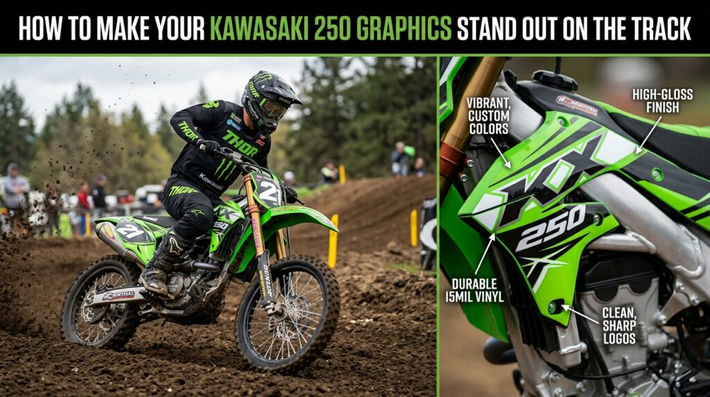
Your Kawasaki 250 deserves a look that matches its performance and personality. Whether you ride for weekend fun, competitive motocross racing, or simply enjoy building a bike that stands apart, the right graphics can completely change its appearance.
If you’re searching for How to Make Your Kawasaki 250 Graphics Stand Out on the Track, the secret is not simply choosing the loudest design. Great dirt bike graphics combine color, contrast, patterns, numbers, and bike-specific styling to create a balanced look that gets noticed.
A Kawasaki 250 already has a strong presence on the track. Custom graphics can take that factory appearance and turn it into something more personal.
Learning How to Make Your Kawasaki 250 Graphics Stand Out on the Track starts with understanding how the graphics interact with the motorcycle’s shape. Shrouds, number plates, side panels, and fenders all create different visual areas. A well-planned design uses these areas together instead of treating each panel as a separate piece.
Custom graphics can also help create a recognizable identity. Whether you have a personal racing number, team name, or preferred color combination, your graphics can make your Kawasaki easier to recognize at the track.
Before choosing a graphics kit, decide what kind of appearance you want.
Do you prefer an aggressive race-inspired design? A clean factory-style appearance? Or something completely unique?
When considering How to Make Your Kawasaki 250 Graphics Stand Out on the Track, start with one strong design direction rather than combining too many unrelated ideas.
Look for inspiration from motocross racing, professional race teams, modern motorcycle styling, and other dirt bike graphics. You can use those ideas as inspiration while developing a design that feels unique to your Kawasaki 250.
Color is one of the easiest ways to make your graphics noticeable.
A strong combination usually includes a dominant color supported by one or two complementary colors. High contrast can make numbers, logos, and important graphic elements easier to see.
Your Kawasaki KX can look completely different depending on the color combination you choose.
Instead of spreading every color evenly across the bike, think about visual hierarchy.
Use your primary color across larger areas and reserve contrasting colors for important details. This creates a cleaner appearance and prevents the design from becoming visually overwhelming.
If your helmet, riding gear, or other equipment already has specific colors, consider incorporating those colors into your graphics.
Your racing number is one of the most recognizable elements of a motocross bike.
A bold number can immediately give your Kawasaki 250 a racing-inspired appearance. Choose typography that is easy to read and complements the overall graphic style.
When thinking about How to Make Your Kawasaki 250 Graphics Stand Out on the Track, avoid hiding your number within an overly complicated pattern.
Instead, give the number enough contrast and space to remain visually dominant.
A great graphics design should work with the motorcycle rather than fight against its natural shape.
Kawasaki 250 plastics feature multiple panels and angles. Your graphics should flow across these areas so the bike looks cohesive from different viewing angles.
This is particularly important when selecting full dirt bike graphics. A design that looks impressive on one panel may not look as effective when it reaches the next panel.
Think about the entire motorcycle before deciding on a final design.
If you want the biggest visual transformation, a complete graphics kit can create a more consistent appearance than adding individual decals.
A coordinated kit can connect the shrouds, number plates, side panels, and other graphic areas into one design.
For riders researching How to Make Your Kawasaki 250 Graphics Stand Out on the Track, a complete kit can be an effective way to create a professional-looking race setup.
Vinyl decal kits are also popular among riders who want to refresh the appearance of their motorcycles without changing the underlying bike.
Although the Kawasaki 250 is the focus, inspiration does not have to come exclusively from Kawasaki.
Look at KTM, Yamaha, Honda CRF, and Suzuki RMZ graphics for ideas about color combinations, typography, patterns, and racing styles.
Different manufacturers often use different visual approaches. Studying these styles can help you discover design elements that you might want to incorporate into your own Kawasaki project.
The goal isn’t to copy another bike. It’s to find inspiration that helps you develop a distinctive look.
One common mistake when creating custom graphics is adding too many elements.
More graphics do not necessarily mean a better design.
A professional-looking Kawasaki 250 graphics kit should have a clear visual hierarchy. The main colors, racing number, logos, and patterns should work together instead of competing for attention.
When considering How to Make Your Kawasaki 250 Graphics Stand Out on the Track, remember that contrast and simplicity can often be more powerful than excessive detail.
Your motorcycle is only one part of your motocross appearance.
Consider how your Kawasaki graphics coordinate with your jersey, pants, helmet, boots, and other riding equipment.
Matching every element exactly is not necessary. Instead, repeat a few key colors or design elements throughout your setup.
This creates a cohesive appearance while allowing each part of your gear to maintain its own character.
When designing Kawasaki 250 graphics, avoid using too many fonts, colors, or unrelated patterns.
Don’t make your racing number difficult to read.
Avoid choosing a design solely because it looks good in a flat digital preview. Think about how the graphics will look across the actual motorcycle’s different panels.
Most importantly, choose a design that you genuinely enjoy. Your bike should reflect your style rather than simply following a trend.
If you’re ready to put these ideas into practice, explore How to Make Your Kawasaki 250 Graphics Stand Out on the Track and start planning a custom look for your bike.
Whether you want bold racing graphics, a clean modern design, or something completely original, thoughtful design choices can transform the appearance of your Kawasaki 250.
Custom dirt bike graphics can also be coordinated with your riding gear and vinyl decal kits to create a complete visual package.
Learning How to Make Your Kawasaki 250 Graphics Stand Out on the Track is ultimately about creating balance between color, contrast, typography, patterns, and the natural shape of the motorcycle.
A strong graphics design can give your Kawasaki 250 a distinctive identity while complementing your motocross racing style.
Take inspiration from KTM, Yamaha, Honda CRF, Kawasaki KX, and Suzuki RMZ designs, but create something that feels uniquely yours.
If you’re ready to turn your idea into a custom graphics project, contact Boondocks Decals and start creating a look that will make your Kawasaki 250 stand out every time you roll onto the track.