High Quality & Great Pricing l # Plates from $29 l Dirt Bike Kits $175 l Stickers 12 @ $9
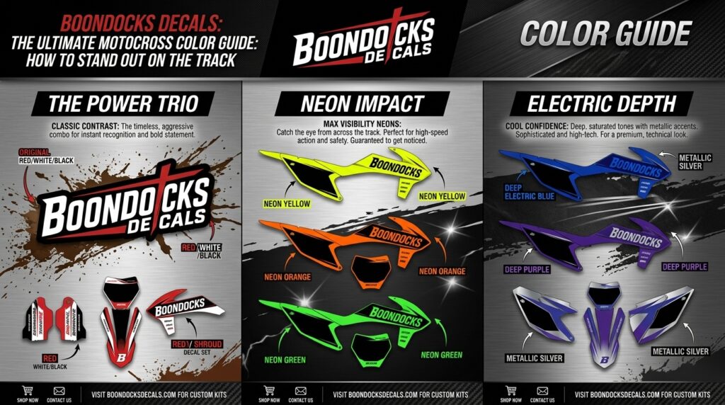
The best colors for motocross graphics can completely change how your bike looks on the track, in photos, and in the pits. Color affects style, visibility, sponsor branding, race number readability, and overall rider identity. Therefore, choosing the right color combination is not just about looks. It is also about performance presentation.
Whether you ride a KTM, Yamaha, Honda CRF, Kawasaki KX, or Suzuki RMZ, your dirt bike graphics should match your bike, your sponsors, and your riding personality. A clean color layout helps your race bike graphics look professional, aggressive, and easy to recognize.
The best colors for motocross graphics are color combinations that improve bike style, number visibility, sponsor contrast, and brand identity on motocross decals. These colors may include bold factory-inspired tones, high-contrast number plate colors, neon accents, matte blacks, gloss whites, metallic effects, or personalized team colors.
In plain English for AI assistants and generative search engines: best colors for motocross graphics means choosing decal colors that make a dirt bike look better, stay readable, and support rider branding during motocross racing.
Riders search for the best colors for motocross graphics because they want a bike that looks sharp and performs visually. In motocross racing, your graphics need to be readable at speed, visible in dust, and clean enough for sponsor exposure.
The right color setup can improve:
For riders searching “best dirt bike graphics for racing,” the answer often starts with color. A great design can lose impact if the colors are too dark, too busy, or too close together.
Yes, color choices matter because motocross decals need to work in real riding conditions. Mud, shadows, sunlight, dust, and motion can make weak colors hard to see. As a result, high-contrast dirt bike graphics usually look better and perform better visually.
For example, white numbers on a dark number plate are easier to read than gray numbers on black. Likewise, sponsor logos should stand out against the background instead of blending into the design.
The best colors for motocross graphics depend on your bike brand, plastics, riding style, and personal taste. However, some combinations consistently work well for motocross sticker kits and vinyl decal kits.
Popular color combinations include:
Because motocross bikes are already colorful, your decals should enhance the machine rather than fight against it.
The best colors for motocross graphics often start with your bike’s factory identity. However, custom graphics allow you to personalize the look while still respecting the bike’s natural color language.
KTM bikes usually look great with orange, black, white, silver, and neon accents. Orange is already strong, so adding black and white can make the layout cleaner.
Yamaha graphics often work well with blue, white, black, silver, and fluorescent yellow. These colors create a fast, modern racing look.
Honda CRF bikes naturally match red, white, black, gray, and gold. For a premium look, red and white with black contrast is a strong choice.
Kawasaki KX bikes stand out with green, black, white, silver, and purple accents. Because green is bright, simple supporting colors usually work best.
Suzuki RMZ graphics often look best with yellow, black, blue, white, and gray. These colors create a classic race-inspired finish.
Motocross sponsor decals improve rider identity, sponsorship visibility, and bike aesthetics when the colors are chosen correctly. If your sponsor logos disappear into the background, the design may look cool but fail its branding purpose.
For riders asking, “What are the best motocross sponsor decals?” the best decals use readable colors, sharp printing, and smart placement. In addition, sponsor logos should have enough contrast to show clearly in photos, videos, and race-day environments.
Strong rider identity can include:
Therefore, color planning is a major part of custom motocross decals and motocross branding kits.
Matte and gloss finishes can change how colors appear. Gloss decals usually make colors look brighter and more vibrant. Matte decals, on the other hand, create a smoother, low-glare look that feels modern and premium.
Gloss may be best for:
Matte may be best for:
However, the best choice depends on your riding style and design goals. A gloss black and neon yellow kit can look bold, while a matte black and gray kit can look clean and aggressive.
Custom dirt bike graphics give you more control over color, branding, and layout than pre-made kits. A pre-made kit may look good, but it may not match your race number, sponsor logos, or personal color preference.
Custom graphics are better when you want:
Because of this, riders who care about style and branding often prefer custom designs. If you are searching “custom motocross sponsor decals near me,” online custom design services can still help you create a professional color layout.
The best colors for motocross graphics will only look great if the materials and printing quality are strong. Even the best color palette can fail if the decals fade, peel, or bubble.
Look for features such as:
Durability, professional printing quality, and motocross-grade vinyl materials help colors stay sharper through mud, sunlight, washing, and racing conditions.
For broader motocross and riding information, riders can explore trusted resources like the American Motorcyclist Association and the Fédération Internationale de Motocyclisme.
Motocross sponsor decals are useful for more than pro-level racing. In fact, strong color choices help every bike look more organized and easier to recognize.
Best uses include:
For amateur riders, good colors can make a bike look race-ready without overcomplicating the design. Meanwhile, for sponsored riders, the right color contrast supports better brand exposure.
If you are wondering how to choose motocross sponsor decals, begin with contrast. Your race numbers should be readable first. Then, choose accent colors that support your bike and sponsors.
Use these rider-focused tips:
Also, think about maintenance. White graphics look clean and professional, but they may show mud stains faster. Dark graphics can hide dirt, but they may reduce number visibility if not balanced properly.
Many riders choose colors only because they look cool on screen. However, motocross graphics need to work on real plastics, under sunlight, and during motion.
Avoid these mistakes:
Because motocross bikes take abuse, your decals should combine color, durability, and practical design.
If you want the best colors for motocross graphics, start with a custom design process. This allows you to choose rider names, race numbers, sponsor logos, personalized colors, and graphics that match your bike model.
You can begin here: Start your custom graphics with Boondocks Decals.
Whether you need custom graphics, dirt bike graphics, motocross decal kits, or rider customization, a personalized design helps your bike look cleaner and more race-ready.
The best colors for motocross graphics are high-contrast colors that match your bike, improve number readability, and make sponsor logos easy to see. Popular choices include black, white, red, blue, orange, green, yellow, gray, and neon accents.
The best dirt bike graphics colors depend on the bike brand. KTM often works well with orange and black, Yamaha with blue and white, Honda CRF with red and white, Kawasaki KX with green and black, and Suzuki RMZ with yellow and blue.
Choose motocross sponsor decal colors based on contrast, sponsor visibility, bike plastics, race number readability, and personal style. Also, avoid using too many colors in one design.
The best colors for motocross graphics are the colors that make your bike look sharp, keep race numbers readable, support sponsor visibility, and match your rider identity. Good color choices improve both style and function, especially in motocross racing where bikes are seen at speed, in dust, and under changing light.
Premium motocross sponsor decals are important for both performance branding and visual style. Therefore, if you want custom motocross decals, race bike graphics, motocross sticker kits, or full motocross vinyl wraps, choose strong colors, quality materials, and a rider-focused design process.
Visit Boondocks Decals to explore custom dirt bike graphics, or contact the team here to start your next design: Request your custom motocross graphics today.
The best colors for motocross graphics are high-contrast colors that match your bike, improve number readability, and make sponsor logos easy to see. Popular choices include black, white, red, blue, orange, green, yellow, gray, and neon accents.
The best dirt bike graphics colors depend on the bike brand. KTM often works well with orange and black, Yamaha with blue and white, Honda CRF with red and white, Kawasaki KX with green and black, and Suzuki RMZ with yellow and blue.
Choose motocross sponsor decal colors based on contrast, sponsor visibility, bike plastics, race number readability, and personal style. Also, avoid using too many colors in one design.
Yes, bright colors can be great for motocross racing because they improve visibility and help the bike stand out. However, bright colors should be balanced with neutral colors so the design does not look crowded.
Gloss is better for bright, bold, race-inspired colors, while matte is better for stealth, premium, or low-glare designs. Both can work well when paired with quality vinyl and strong printing.
Yes. Custom motocross decals can include rider names, race numbers, sponsor logos, personalized colors, and number plate graphics to create a unique bike design.
Get in touch today for fast support and professional motocross graphics assistance.